Explore Widgets
The Dashboard provides the following widgets. You can choose to hide or display these as needed.
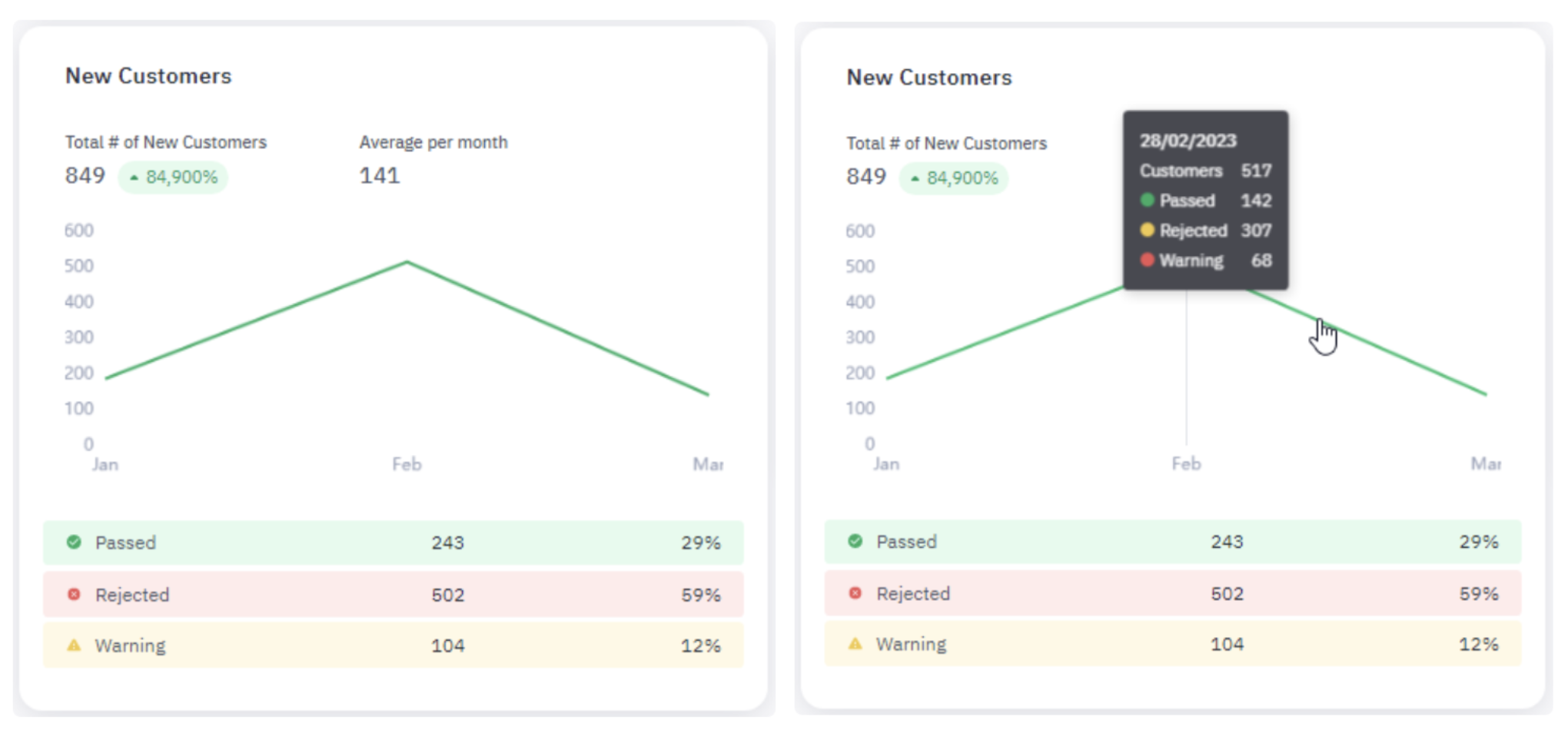
1. New Customers
The New Customers widget shows the number of new customers gained during the selected time frame and the average gained per day, week, or month. A line graph maps the number of new customers over time.
New customers are broken down according to the following statuses:
- Passed: The customer’s initial transactionClosed was approved based on the score assigned by the workflow.
- Rejected: The customer’s initial transaction was rejected based on the score assigned by the workflow.
- Warning: The customer’s initial transaction was assigned a score by the workflow that flagged it for review.
Jumio identifies a new customer when we receive a transaction from your organization that does not fall under an existing account.
Hover over the graph to see the total number of new customers, along with their statuses (Passed, Rejected, Warning).
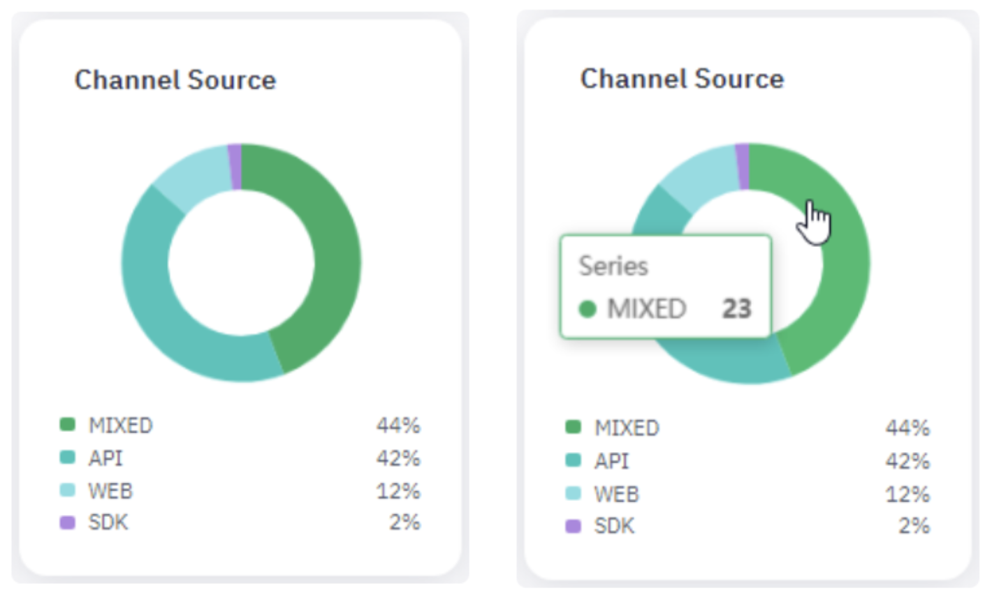
2. Channel Source
The Channel Source widget is a donut chart that reveals the percentage of transactionsClosed created during the selected time frame through each integration channel your company uses to interface with Jumio. These channels could include any of the following:
- API: Transactions created through Jumio's REST application programming interface (APIClosed). For more information see REST APIs.
- Mixed: Transactions involving multiple channels. For example, if someone initiates a transaction using the Jumio Web client and then completes the transaction through the API, it would fall under the Mixed category.
- SDK: Transactions created through mobile applications via the Jumio Software Development Kit (SDKClosed). For more information see Mobile SDKs.
- Web: Transactions created through the Jumio Web clientClosed. For more information see Web Client.
Hover over the graph to see the percentage of transactions by each channel.
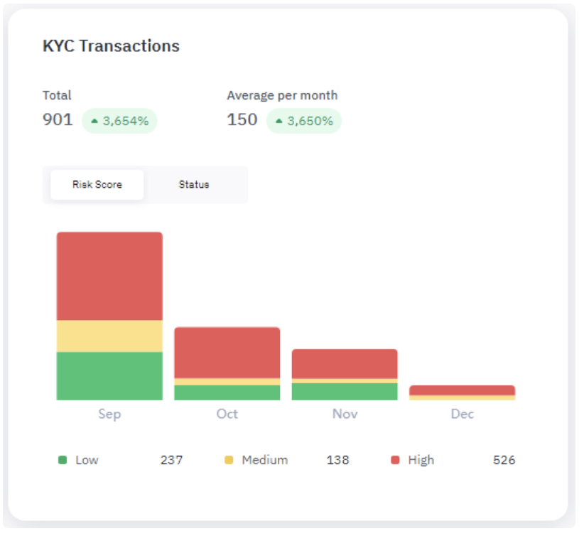
3. KYC Transactions
The KYC Transactions widget displays the following data:
-
Total: Number of KYC transactionsClosed your company has processed with Jumio during the selected time frame along with the percentage change over the same time frame of the previous year.
-
Average per day/week/month: Average number of transactions processed per day, week, or month, along with the percentage change in this average over the same time frame of the previous year.
The bar graph shows the average number of KYC transactions per day, week, or month. Each bar is color-coded to show the breakdown of transactions by risk score or status. Use the Risk Score and Status buttons to toggle between the two categories.
At the bottom of the graph are the number of transactions for the selected time frame broken down by Risk Score or Status.
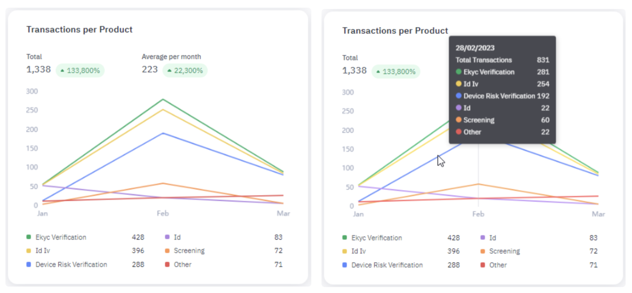
4. Transactions Per Product
The Transactions per Product widget shows the following data:
- Total: Total number of transactions, processed during the specified time frame along with the percentage change over the same time frame of the previous year.
- Avg per day/week/month: Average number of transactions processed per day, week, or month, depending on the selected time frame, along with the percentage change over the same time frame of the previous year.
The line graph shows the total number of transactions over time for each Jumio product purchased by your organization. At the bottom of the graph are the number of transactions for the selected time frame broken down by product.
Hover your pointer over the graph to view the numbers broken down for a single day, week, or month.
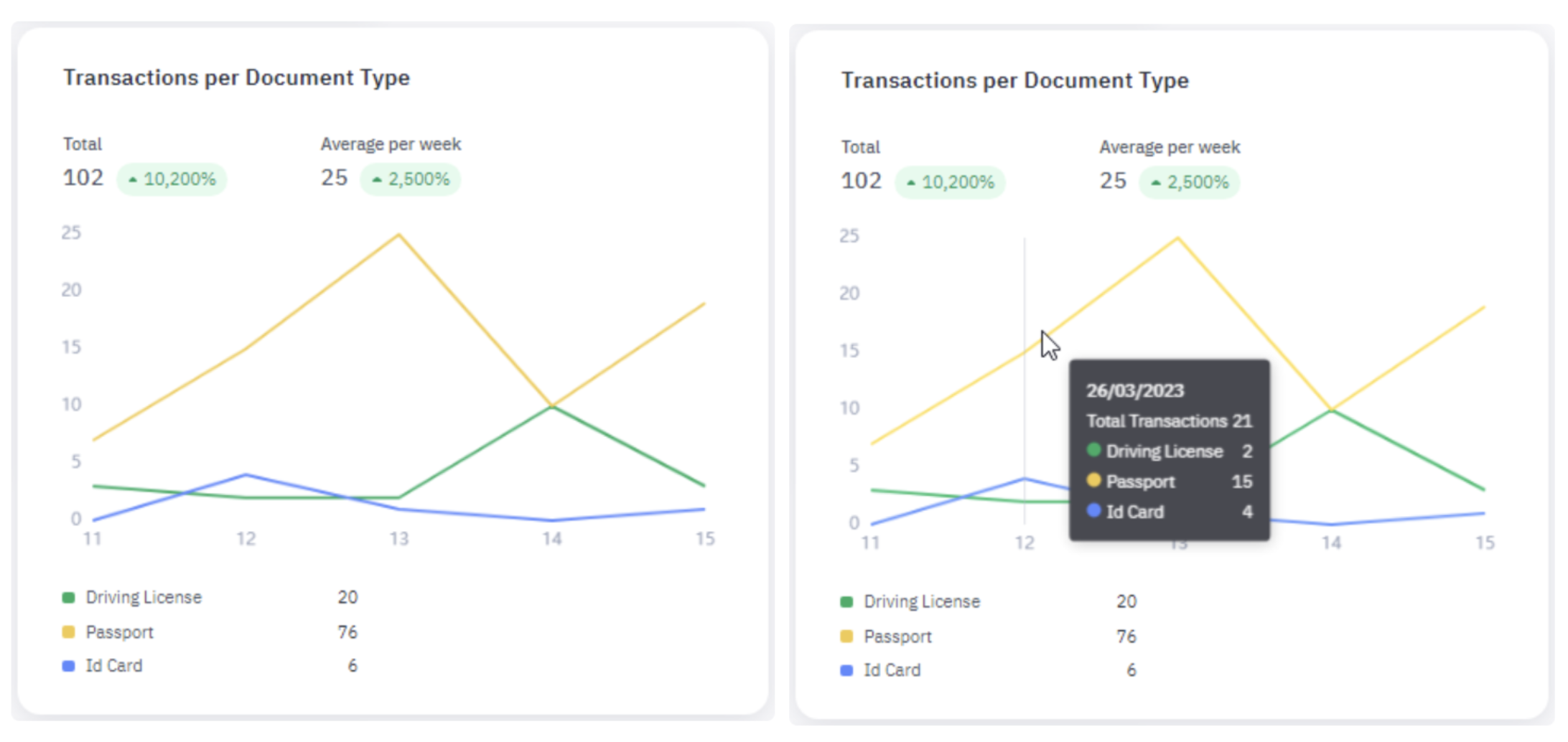
5. Transactions Per Document Type
The Transactions per Document Type widget shows the following data:
- Total: Total number of transactions, processed during the selected time frame that included some type of document, along with the percentage change over the same time period of the previous year.
- Avg per day/week/month: Average number of transactions processed per day, week, or month, that included some type of document, along with the percentage change over the same time period of the previous year.
The line graph is color-coded to show the number of transactions over time involving each type of document. At the bottom of the graph are the number of transactions for the selected time frame broken down by document type.
Hover your pointer over the graph to view the numbers broken down by a single day, week, or month.
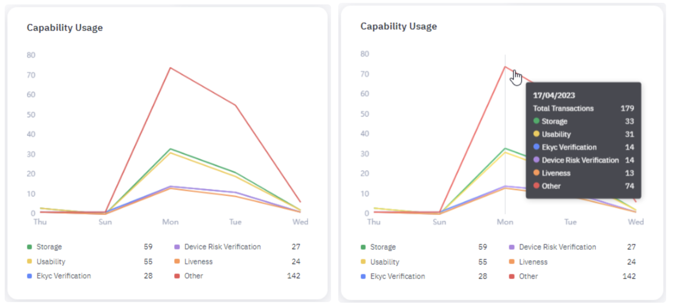
6. Capability Usage
The Capability Usage widget is a color-coded line graph showing the top five capabilities by volume of transactions during the selected time frame. Capabilities not in the top five are grouped into the Other category.
Hover your pointer over the graph to view the number of transactions for each capability in a particular time period.
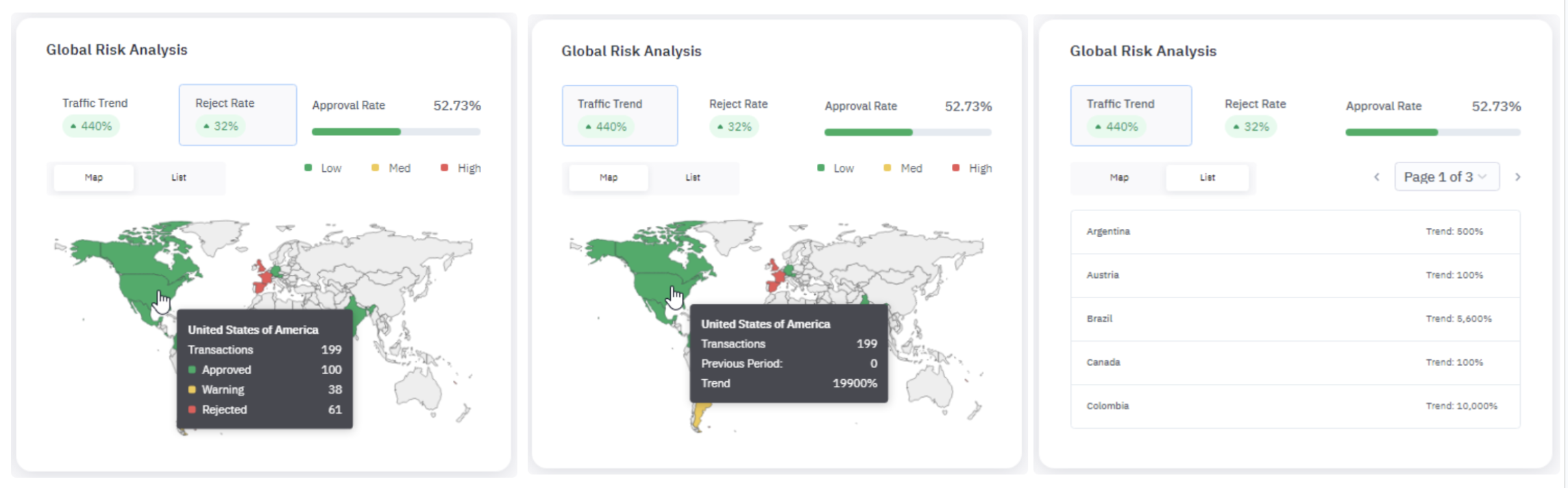
7. Global Risk Analysis
The Global Risk Analysis widget is an interactive map showing the following data for the selected time frame,
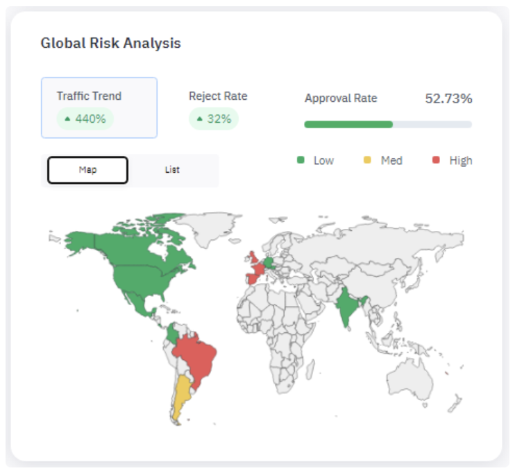
- Traffic Trend: The percentage change in the number of transactions processed through Jumio over the same time frame from the previous year.
- Reject Rate: Percentage change in the number of transactions rejected over the same time frame from the previous year.
- Approval Rate: Percentage of transactions from all countries that were approved.
Click the Traffic Trend or Reject Rate data field to show related data on the map.
With Traffic Trend selected, hover your pointer over the map to view a country’s total transactions for the current and previous periods (the same time frame from the previous year) as well as the trend, or percentage change between the two.
Hover over the map to see country-specific data. You can switch between Traffic Trend and Reject Rate views.